Journal · Design Judgment
Curtains do not match a room. They translate the floor into light.
Most curtain decisions begin too late and with the wrong question: what colour should they be? By that point the room has already been designed in fragments.
Short answer
Most curtain decisions begin too late and with the wrong question: what colour should they be?
Most curtain decisions begin too late and with the wrong question: what colour should they be? By that point the room has already been designed in fragments. The floor has a temperature. The wall has a depth. The timber, upholstery and daylight have established their own relationship. Then the window is given a bright new colour, a thin synthetic fabric, or a stark white sheer, and the whole composition starts to separate.
A window treatment should not be chosen to match one thing. It should translate the floor, the wall and the light so that the room feels like one material decision.
One way to read a room
Start at the floor, not at the fabric book
The floor is usually the largest continuous surface in a room. It establishes the underlying temperature before furniture arrives: warm timber, pale stone, deep terrazzo, a mineral grey tile. The curtain does not need to repeat that colour literally. It needs to carry some of its character upward.
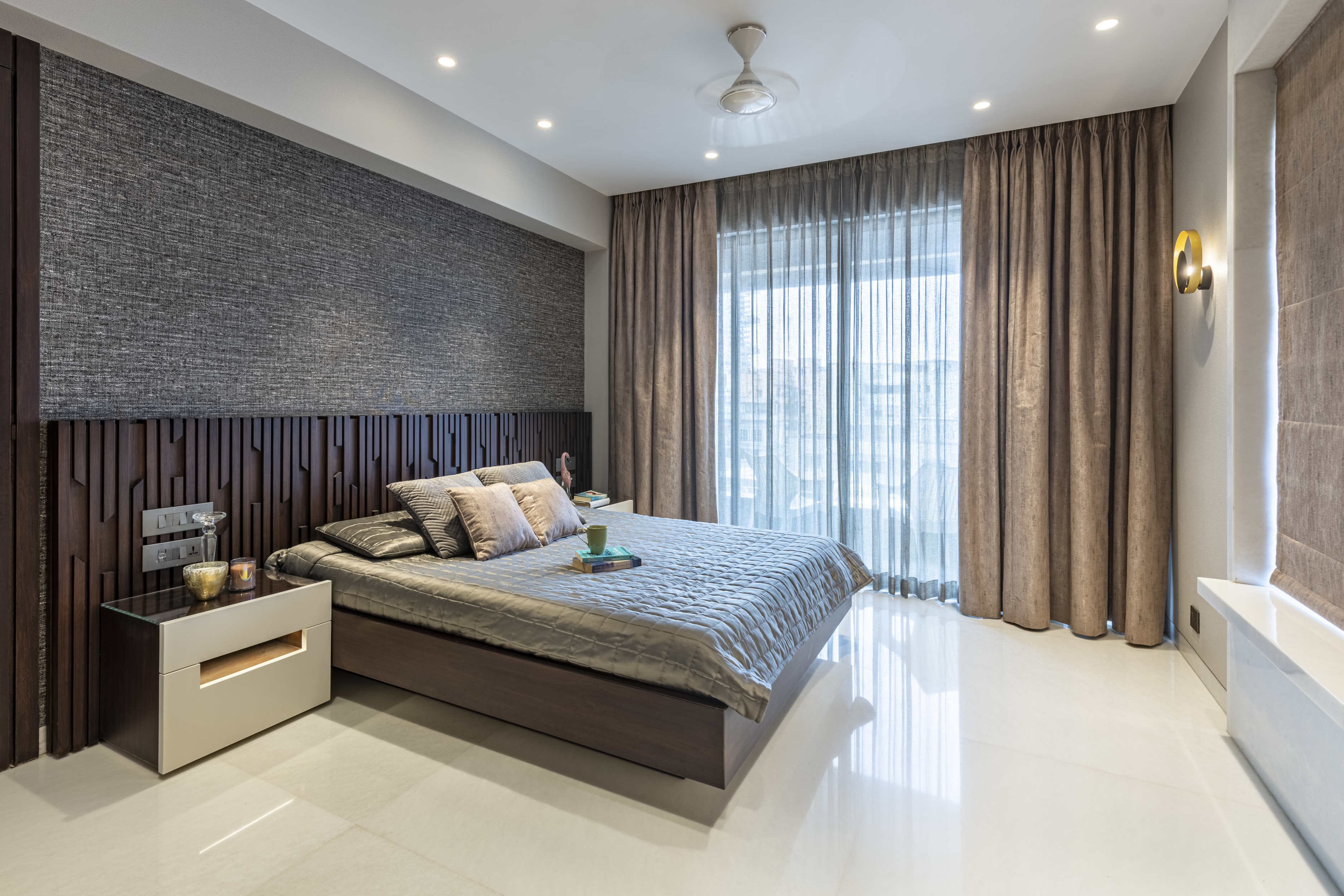
With a warm floor, a sheer that is slightly softened rather than optical white will usually hold the daylight more naturally. An outer curtain in tobacco, oat, putty, muted olive or a warm grey can give the room depth without turning the window into a separate feature. With a cooler mineral floor, chalk, mushroom, softened charcoal or a quiet green may be the better bridge. The principle is not a palette formula. It is to make the vertical fabric feel like it belongs to the horizontal surface beneath it.
This is why a curtain can be technically the right size and still feel wrong. It may be too white against warm timber. Too shiny against stone. Too saturated for an otherwise quiet room. Scale cannot rescue a material relationship that was never resolved.
What matters
A sheer and a curtain are doing different work
The sheer controls the quality of daylight. Linen and linen-look sheers have enough irregularity to soften glare without making the window feel flat. They give privacy, but they still let the room breathe. The outer curtain does something different: it adds weight after sunset, gives the wall a finished edge, and lets the room feel quieter and more complete.
The two layers should not be chosen as separate purchases. A pale sheer under a richer outer fabric is often what gives a window treatment its range. During the day, the room holds light. At night, the curtain gives it depth.
The outer layer does not always need to be plain. A restrained print can be beautiful when it has a reason to be there: perhaps it repeats the softened red in a cushion, the tobacco in a timber finish, or the mineral line in an artwork. A richer weave, wool blend or matte velvet can do the same work without pattern. What matters is that the fabric picks up an existing conversation in the room. It should not begin a new one at the window.
What matters
Why some bright curtains make a room look cheaper
Colour is not the problem. An unrelated colour is.
A high-chroma curtain across a full wall becomes a large isolated block. In daylight it competes with the view and the wall. At night it can look harsher still, particularly when the fabric has shine, the folds are too flat, or the hardware is trying to be decorative on its own. The result is not always loud because it is bright. It is loud because nothing else in the room is carrying that note.
The same is true of stark white. Against a warm stone floor, timber or layered neutral upholstery, optical white can appear cold and blue. A warmer white, bone, ecru or soft stone often gives the same freshness without breaking the room's temperature.
Rich is not the same as more colour. Rich is a fabric with depth, proper fullness, and a relationship to the materials already in the room.
What matters
Then resolve the architecture
Only after the material relationship is clear do the proportion decisions begin. Run the track high and wide so the window reads taller and the stacked panels do not cover the glass. Use enough fabric for the folds to hold their shape. Let the hem, floor break and hardware finish belong to the room's degree of formality rather than calling attention to themselves.
A window treatment feels expensive when it does not look like a late addition. It looks as though the floor, the wall, the fabric and the light were read together from the beginning. That is the difference between covering a window and completing a room.
Related
Residential Interiors →
Principal-led design where proportion, material, and lived use are resolved together.
What Makes a Room Feel Designed, Not Decorated? →
Why the final visual layer must still belong to the room's original composition.
Interior Designers in Mumbai →
How a principal-led studio resolves a home as a whole, from spatial proportion to the final material layer.
FAQ
Common questions
Should curtains match the floor?+
Not literally. The floor is the largest continuous material plane, so the curtain should carry its warmth or mineral restraint upward without becoming a colour match.
How should sheers and curtains work together?+
The sheer softens glare and provides privacy in the day. The outer curtain adds depth, weight, and a finished edge at night. They should be selected as one window treatment, not as separate purchases.
Why do bright curtains sometimes look cheap?+
A high-chroma or shiny fabric becomes a large isolated block when it does not repeat an existing material or colour note. Richness comes from depth, fullness, and material relationship, not from more colour.
Design Judgment